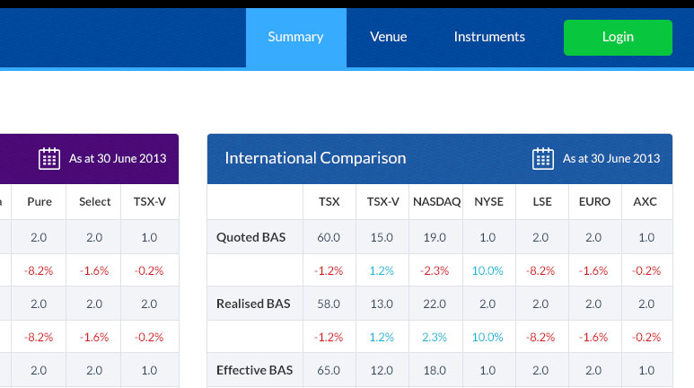
Dashboard project with a soft color scheme. The main objective I had when designing it was to make it easy to use and intuitive. The tables need to show a lot of information so it was very easy for it to become busy and cluttered. The client rejected it on the basis that it was too plain looking. I guess you can’t win ’em all, right?